What I have Learn...
This semester I had a chance to take a more in depth look with the human anatomy, something that I have always hope of doing when enrolling at UW-Stout. Took me 4 years but I finally had the chance to take a crack at it. The bone drawing was a great exercise for me to study the bone structures. I was able to get a better understanding of each different sides to a bone. The self Portrait assignment afterwards was great too. After working with the skull, I liked how we were able to apply that with self portraits.
I guess one of my best work is my self portrait. (first one below) Now that I look back at it, I really wished I would have used charcoal pencils instead. But it was a great experience working with a new media like conte (I mean it's not new, but new to me). Just something I haven't try so that I know what to expect next time around.
It has been a great experience this semester. I guess my weakest is still shading. Always not good and hope to get better. Thanks everyone for a great time. Keep looking back to my blog for more stuff from me!
Thursday, December 18, 2008
Self Portrait


 Self Portrait
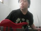
Here are the self portrait of ME. I used conte pencil on Stone Henge paper. It was my first time using Conte pencil and it didn't shade as well as I thought it would like a charcoal pencil.
Figure Drawing/Study

Here is a figure study drawing of a model in class. Here I tired figuring out the side planes of the model's body as well as establish some cross contours to give it volume.
Tuesday, November 11, 2008
Skeleton drawing process
 Back Side
Here is an in-progress drawing of my skeleton drawing. I am currently learning the human skeleton and thus, this study should help me explore more in depth into the structures and functions of each bone.
 Front Side
Monday, October 20, 2008
Hand Drawing
 Bone Drawing (Hand)
Here's another bone drawing done in my class. In this drawing, I try to represent the plane changes with the darken values. However, since this was almost a straight on view of the back hand, there weren't much to suggest. Also, due to that, I've added some cross-contours in it as well just so that it doesn't look so plain.
Sunday, October 12, 2008
Cleaner picture
 Here is a cleaner picture of my previous post a couple of weeks ago. Sorry for the delay but getting a good quality camera is hard to come by!
More bone drawings from Life Drawing II
 Here is my drawing from Life Drawing II class. Below is my groups critique on this drawings.
Kalvins' – Pelvis might be a little big too wide. Right side seems a little bit bigger. Good contour lines that work well with shading. Rib cage looks like a different angle then the pelvis, good spacing between pelvis and rib cage. Line values need a little more consistency. Spine darkens up a little big. Gestural on the pelvis, but not in the ribs.
Feel free to comment!
Monday, September 29, 2008
I notice...
 From the Gallery at UW-Stout
I notice assignment for Life Drawing II class.
I notice...
-a spider hanging down into the water by a boat
-old Japanese style painting
-waves
Wednesday, September 24, 2008
Bone Drawing from Life Drawing II class
 Bone Drawing!
Here's a recent drawing from my life drawing 2 class with instructor, Amy Fitcher. Okay, to be honest, I don't have a camera. So instead, I used the web cam on my lab top. I will try to get a hold of a camera by the end of the week and post up a new picture of this one. Enjoy!
Monday, September 22, 2008
Check this book out!
 "Bridgman's Complete Guide to Drawing from Life"
George Bridgman
Editor: Howard Simon
This is a GREAT book that I ran into and picked up! It's prefect if you would like to learn more about the human anatomy. It's got just about everything you need to know about all parts of the body. I'm going through this book little at a time. Picking up tips and tricks where ever I can. Go to your local library and check it out. It's prefect to what I am learning right now in my Life Drawing II class at college and it's great for other independent studies of other areas that you may have trouble with.
Wednesday, September 10, 2008
Artworks Again
 Title: "Letter Form Designs" 2007
Media: Print on Card Stock paper
Description: Letters to form designs
Artist's thoughts: So this was one of my Graphic Design project that most of my colleague have done as well. The objective was to create sets of designs to express an emotion using letters. I really had a hard time doing this project and a lot of researching of design and how it relates to emotions. The end process, I used a black matting board with red paper as my cover. To bring out the red in the center, I thought I would off set the color by using a darker green as my binder.
More works from Stout
 Title: "Frozen Motion" 2006
Media: Wood w/oil polish
Description: Movement in 3D form.
Artist's thoughts: When I thought of movement in 3D space, I thought of the human figure/form. To be honest, I thought back to the Greeks and Roman sculptures, the classic antiquity style of appreciation of the human body. However, we were working with wood piece and I didn't want to mimic the sculptures too much. So I decided on an abstract form, in this case a female form for a change. In the work, I have five different layers. (Not including the radical hair that sprouts up to mid-air). Each layers therefore works to bring 3D to the form. Bringing out the figures legs and arm while the head remains behind the shoulders. This work can also be viewed from behind in the same sense.
Some of my artworks at Stout
 Title: Space in Time
Media: Color toothpicks w/phone ball and fishing wire
Description: Out of the Box concept. To show space and volume in a 3-dimensional representation.
Artist thoughts: When I was deciding what I should do to show space and volume, I didn't know where to start. I remember thinking to myself the night before class when our ideation were due, that I wanted my form to be chaotic and somewhat corrupt. (kind of like time) I started looking at works from Cornelia Parker. One in particular was her work titled "Anti Mass." Her work was the inspiration and ultimately the result of my work "Space in Time." I guess you can't see it well on this image, but the other side of the cube is broken and has the feeling that it has collapsed or started to deteriorate. The toothpicks there then looks chaotic, but at the same time, draws viewer's eyes into the broken section.
Subscribe to:
Posts (Atom)